Monday, October 17, 2011

When I get Gauguin

You see what I did there?


Getting ready for a week of paper proposals, readings, slide tests and so on brought me on to a subject that really gets me going: Paul freaking Gauguin.


He didn't just magically spring into my head, unfortunately he was summoned there by my Gender & Modernism readings for the week. The paper that did the damage was Abigail Solomon-Godeau's, "Going Native: Paul Gauguin and the Invention of the Primitivist Modernism". Our topic of discussion is Gender, Race and Modernism and we're supposed to ask ourselves why modern art 'fetishizes' otherness? I'll get to that in my reading response, but the reason I came on here today was because the man incenses me and reminded me of yet another paper I wrote that expresses my thoughts on Gauguin and the Tate Modern exhibition I reviewed for a class last spring.


I'm trying to establish a writing style that engages and educates, so again I hope you enjoy and feel free to disagree. While I think the artist is deplorable, I think his art is brilliant. So here it is:


Maker of more than a few mistakes: Gauguin: Maker of Myth (at the Tate Modern) leaves something to be desired.

Stepping into Gauguin: Maker of Myth is like leaving the brightly lit corridors of the Tate Modern and setting foot into the arrivals hall of a foreign country: there are crowds milling, there is little to no English spoken, and a sense of frenetic excitement of what is to come once the doors to the unknown open. After the allotted fifteen minute wait to enter one is enveloped by the psyche that was the tortured genius of Paul Gauguin (1848-1903), the Post-Impressionist painter who was one of the cult artists of the early twentieth century.  However the confused exhibition title and thematic hanging of the works leaves what should be a spectacular show falling slightly flat and with a tepid grasp for the artist and his merits.

It is a show characterized by what one can only assume to be an extensive advertising campaign and you could almost accuse the Tate of showboating. To elaborate, a name as famous as Paul Gauguin is sure to generate attention and attract the masses - especially if the institution is toting the show as the biggest retrospective of the artist’s work in fifty years. It is what is commonly known as a ‘blockbuster’ and is meant to have visitors crowding to enter and exit with a kitschy memento such as the knit your own Gauguin puppies.

Such a tactic worked favourably, the show was a safe gamble opening to positive acclaim and record-breaking numbers. Yet the biggest offense was the choice to show the works not chronologically but by theme. The exhibition notes state that ‘Rather than following a strictly chronological sequence, Gauguin: Maker of Myth is organized according to thematic sections that emphasize the parallels between different stages in his career.’ Curating the show this way is a bold move as it makes it very difficult for those who are not familiar with the artist’s work to get a sense of his growth and stylistic advances. The effort is applaudable but nevertheless fails as the themes often feel contrived and fail to be completely convincing.

Stepping into the first room, titled Identity and Self-Mythology literally brings you face to face with the artist. Along the right hand wall there are series of self-portraits moving from oldest to most recent and this is one of the only instances where the exhibition achieves a sense of the evolution in the painter’s style. It is an intimate moment to see the young Gauguin change to the seasoned painter and traveler in the year he died in Tahiti and it is the lack of this intimacy in the rest of the show that leaves you with unresolved feelings as you leave.

The next room, Making the Familiar Strange, succeeds in exposing a mythical aspect of his painting yet it seems a strange phrase to umbrella the range of work in the room which include still lifes, experimentations in pottery, wood carving and several preparatory drawings. The painting that best suits this title is Clovis Falling Asleep, 1884, an unusual look into the painter’s family. The painting depicts the young son of the artist drifting into sleep, resting his head on a table upon which also rests a large wooden tankard, which stood on a plinth next to the painting. The relatively simple canvas is divided into two planes: one firmly anchored to earth which is the surface Clovis rests his head upon and the other is the bright blue patterned wallpaper that seems to present the child’s subconscious as it flits through a dream. The articulation of brushstrokes can be compared to Van Gogh’s loose style and the array of colors is a magical haze that seems to solidify the idea of dreams. The eye moves from the pale shades of the boy, to the solid figure of the tankard and then takes in the translucent figures that seem to float above the child’s head. Clovis Falling Asleep is one of the monumental successes of the exhibition because it touches briefly on an intimate moment of Gauguin’s and reinforces his status as a modern artist, as it was due to subconscious themes.


Walking through the show, one gets the feeling that the curators are aiming to squeeze you through the U-shaped exhibition getting glimpses of the famous works here and there, but aiming for you be in and out within a half an hour slot so as to keep the onslaught of crowds churning through. There are several rooms that project off of the ‘path’ where you find compilations of books, newspaper clippings, photographs and posters aimed to give some context into the time around the painter. These would be more successful had there been less to see as one feels guilty that they cannot read every single article or take in every single picture in detail. There is far too much to absorb and one needs several visits to the show to get a complete taste for the sheer amount of art.

Passing through rooms of Gauguin’s drawings and landscapes give you a mediocre idea of the artist’s style, but it is in the sixth room, Sacred Themes, that there is a moment of pure satisfaction. For a man who seemed to reject society and religion much of his art is pervaded with religious themes and here it is refreshing to see a new side of the artist, not just Tahitian nudes and colorful landscapes, but various biblical scenes, all rendered in his hazy Symbolist style. Yet, this small triumph is quickly overshadowed by a succession of rooms that re-enforce why arranging works thematically can be so problematic.

The largest flaw of the exhibition is the room dubbed Gauguin’s Titles, a room with five large Tahitian paintings each depicting a majestic native woman. This choice seems so extremely contrived that it almost ruins the experience. Gauguin is well known for implementing Tahitian colloquialisms as his titles and there seems to be no need to devote a room to this ‘theme’. It seems a gigantic waste of a title as each of the paintings is majestic and comes close to shining light into the myth of the tropical Edenic paradise.

Perhaps a change in title would lead to less disappointment. Maker of Myth conjures up a fantasy of a man exploring the exotic and unveiling his secrets to the world- one expects the show to be full of completely mind blowing revelations. But where is the myth that the show alludes to? Is it in the man behind the painting or the subject matter that Gauguin chooses to paint? After one sets aside the rather deplorable father and husband from behind the paintings it should have been easy to discover this mythic vision, which was quite avant-garde and mysterious. However, the lack of cohesion between many of the themes leaves you without a solid idea of the painter that Gauguin was. It is an awe-inspiring collection of work, but lacks the chemistry that would have elevated it to more than just a collection of interesting paintings.


- Life is good

Listening to: country music... seriously
Observations: Tree of Life has some wicked brilliant visuals
Craving: not Thai food, that's for sure.


Wednesday, October 12, 2011

Vroom

Does anybody still play with these? 'Cause Miuccia Prada does.
This season Miuccia gender bended by putting her  50s glamazons in wonder dresses, pleated skirts and bandeau tops contrasted with varsity jackets, flames and antique car prints. Ah yes, the car. It adorned almost every look and those flames are why I made the hot wheels connection. Muscle cars, vintage wheels, convertibles etc... 
My two favorite aspects of the show were her accessories: bags bags bags and shoes shoes shoes. Prada bags are superbly covetable as it is but these vintage cars in beautiful supple leather make me forget that they're seasonal and next year they wont be in style. Personally I want the tan bag second from the left.
And the shoes... they make me think burning rubber, broken tail-lights and the country. I'm loving the antique illuminated tail lights that project from the heels and they curling flames as well. I'm predicting that these will be the new hot heels being worn by the editors and stylists and celebs on the front row in the next seasons to come.
I'm inarticulate today and super exhausted after my short field trip to the National Gallery and Library Archives Canada in Ottawa today. Peaaaaacce!


- Life is good

Listening to: 'All My Friends' - LCD Soundsystem
Observations: Sarah Michelle Gellar's new show, Ringer, is actually superb
Craving: Groceries

Tuesday, October 11, 2011

Vin and I are on first name basis now

So all the fashion weeks are over, time to dissect some collections and I'm starting in New York with Rodarte.

While it wasn't the Mulleavy sisters' best collection - the prom style dresses gave the collection a slightly matron-like feel - the inspiration and prints were on tip top form. Timing is everything, so last month when I posted about Van Gogh's brushwork how was I to know that just over a week later the pair was going to set forth a collection that united art and fashion in a spectacular marriage?


Let's be serious Van Gogh is one of the most celebrated artists of the past two centuries and it seems about time that someone paid him due homage; especially after the rejection he faced during his life the least we can do is honour him in death. The girls said that their inspiration came from:
'...Watching the Disney film Sleeping Beauty because I had been fascinated by the animation and the color they used and we both were thinking there was a weird correlation between that and Van Gogh's color palette.'
Huh...? But I guess I can see it


By now I hope it will be alittle more obvious which Van Gogh paintings are in question, they are two of his most famous.

Vase with 12 sunflowers, 1888 (the third version in the Sunflowers series) 
Starry Night, 1889

While the first nine dresses are more obvious in their subject matter, the gold and seafoam sunflower dresses and the abstract, brushstroke starry night dresses however, the magic lies in last two dresses with their more lyrical take on Starry Night, the swirling sequin detailing and gauze move in a way that imitates the night sky. Here are some details of the workmanship and prints exhibiting the girls' sharp eyes for texture, pattern and color. 


These two oil paintings are part of his Paris Sunflower series - I love Van Gogh and took the opportunity to chronicle these lesser known sunflower paintings because of their beautiful colors, brushstrokes and compositions. 


I guess I should take a moment to address the make up... dark dark dark eyes - maybe something to contrast the light feminine clothes, but I think they look like gleaming sunflower seeds. Probably the art historian reading too much into things. Anywhhhoooooooooooo!


On to the next one...


- Life is good

Listening to: 'Another Kind of Green' - John Mayer 
Observations: I hate snuffles
Craving: An American passport so I can play on the Amazing Race... how bout it Dad?

Saturday, October 8, 2011

Why I write ... ask Orwell

I had an assignment due this past week that loosely asked why do you study or write Art History? It was such a challenge, but I finished it with somewhat of a conclusion and I thought I'd share it here. I know I'll never be able to convince everyone, but I want to try... anyway, enjoy:


The intrepid art historian takes on the Orwellian task of ‘Why I write’

I’m hoping that one day in the near future I’ll be able to introduce myself to someone new and dodge the flinching, embarrassing reflex I feel when the topic comes up that I am art history major. Why does it happen? I’m so passionate about art and the discipline I’ve chosen it makes no sense that I should be ashamed to be engaged in said - often neglected - corner of academia. I try to casually brush off any questions with an attempt at nonchalant grace, ‘It’s different. I enjoy it. Something new…etc’, but I see their eyebrows raise, the awkward bobbing of their heads and their sad, twisted smiles that seem to say ‘Oh, you’ll be ok, somewhere out there is a niche for you’. In this world of politics, economic recessions, poverty, natural disasters, and so on, what significance does art history have? Need I validate my choice to pursue a course of study that is desperately in need of attention and, in truth, a fashionable make-over? My approach to writing art history is strongly intertwined with my emotional attachment to the arts and the reason why I’m in this field of study.

In order to discover my approach to writing art history, one needs to know why I love the visual arts. It may be because my mom flooded my childhood with Disney coloring books and easel paints in colors that would have made Joseph, he of the Technicolor Dream Coat, emerald green with envy. Or because my right brain is functioning at ten times the speed of my left, ergo causing an excess of creative thoughts. To be honest, it doesn’t matter how it happened, I love art because it is a liberating expression of emotion, it is reflective of the surrounding culture and times in addition to being a world of adventure and play. Art is this world of magic that confuses and scares people, especially modern and contemporary art and that is partially why there is a stigma attached with it. My ultimate goal as a student of this discipline is to expose the wonderful adventure that I see in it and bring it to the greater public and that directly influences my writing style.

It is difficult studying art history when there are such clichéd stereotypes of art historians, all of which I want to shatter: there is that of the pretentious modern scholar who uses a style and diction that leaves their reader feeling inferior and disengaged with the topic; the second, that disconnected old, stuffy, tweed-wearing professor who smokes a pipe and rambles on about the glory of the Renaissance while sitting in some hallowed hall, often repeating himself and never arriving at a conclusion; and finally the ultra-feminist trying to re-write history and bombarding you with psychological theories about women that make your head spin. I am often assigned readings that feed these stereotypes so well that it is no wonder that many choose to ignore this subject because it is so pretentious, dry and exhausting.

I want to inject a youthful, engaging tone into my art history writings that ultimately draw the reader in and makes them want to learn more about what I’m describing. I want to invite people into my world, where I see art as a challenge and a game – like the wardrobe leading into Narnia. I will acknowledge right now that in trying to use an active and engaging voice I often need to back peddle to make sure I’m getting my point across. However, my writing style is still in its infancy, it is being pruned by my professors, by the readings I encounter and the art that I study.

My upmost goal is to try to engage my audience - enlighten them. A good writer should hold my hand through their thoughts and ideas, pick me up and dust me off when I stumble upon some concept and guide me on the shining path to greater understanding. Two readings I’ve undertaken lately can be brought to the forefront of this. David Foster Wallace’s ‘E Unibus Pluram: Television and US Fiction’, while not an art historical text was an exceptionally interesting read because it was contemporary, made observations I could identify with and did not overpower me with pompous language and tone. I attempt to write clearly and without too many sharp twists and turns, like Foster Wallace and hope that while my choice of diction is casual, it takes on an academic voice. Where Foster Wallace’s writing was a pleasurable experience, I felt as though I was locked in a fierce battle with Stephen Bann when reading his ‘Views on the Past: Reflections on the Treatment of Historical Objects and Museums of History’. He fed right into the disconnected professor stereotype of art historian that I dread reading. I had no emotional engagement with his excerpt at all, something I hope that all writers think about. I got lost in his brilliance, he is clearly an educated fellow, yet I did not grasp the points he was making and felt as though I was going in circles. When I read I want to be left with an idea of who the person is, I want to get to know them through their text and that was something Bann forgot with this paper.


When I write, I want people to come away afterward with a clear idea of why I write and a greater appreciation for art history – I write it because I love it and I want to share it. I'm working on profound. Hoping it will come one day because I want to inform, educate, challenge and inspire others. Until then, I will work on my style and tone in the hopes that I begin to craft the hallmarks of a new era of art historical writing.


- Life is good


Listening to: 'Otherside' - Red Hot Chili Peppers
Observations: Summer doesn't want to let go
Craving: Something profound

Tuesday, October 4, 2011

Christmas comes but twice a year

Now it's here, now it's here...
The McQueen Spring 2012 show was meant start half an hour ago, but in the meantime Style.com and their genius Photowall uploaded several images of the show space.

After the Victorian shapes, and faraway, tribal inspiration of Resort 2012, I'm not sure what to expect with this minimalist, icy blue set. Surprise me Sarah Burton.

- Life is good

Listening to: 'Tiny Dancer' - Elton John
Observations: Fashion week is almost over, Thanksgiving is almost here... where did September go and why is October so cold already?
Craving: A filling snack that wont kill me once half way through my weights session

Thursday, September 29, 2011

Storyboard VI

This storyboard has been in the making for at least over a month so some of these photos are alittle bit older... But they're still awesome so who gives a what?
One of my favorite childhood snacks is now an art medium: Oreo cameos... that's pretty unreal. Think about how tiny they are and the level of detail executed in this Romanesque cameo. You wouldn't want to eat it, or would ya? 

One of the outfits from Zara's Fall Lookbook that I fell absolutely in love with. On one of my last days in London, I went around the city with my mom and made her sift through all the racks to find this coat. 3 Zara stores later... I found it (although not in rust) BUT the downside is: A) I'm not a giraffe aka tall and slim like this model so the coat dwarfed me slightly and B) It doesn't button or close... not very practical for Canadian winters. But it was so pretty. No fair, stupid genetics

One of the classes I'm in is a brilliant adventure into Dutch Baroque art... and here we see Freja (who has been surprisingly absent from these past weeks of fashion shows) in a wonderful Givenchy number and bonnet that does transport me back to the 18th century and a Vermeer painting or two.
Street photgs are taking over the fashion world. Here we have a fun 'twist' on Scott Schuman, the man behind the Sartorialist, in the form of a new website by an admirer: the Sartorialtwist. So fab! Basically the creator of this website takes Scott's images of fashionable people and juxtaposes them with others, to create new and sometimes more interesting outfits. 
Givenchy is taking over the magazines (ok, these are old spreads) as we see here in another feature where Raquel Zimmerman sports a dress by the same collection by Tisci. I'm really into Givenchy lately.
I've been looking for this image of Raquel ever since I watched the September Issue... This photo shoot was one of Grace Coddington's most exquisite visions. This is real Couture shit, guys. 
Having a bit of a Raquel moment today, but this season is one of the first times McQueen has had a magazine campaign if I'm correct. It was amazing to open up the September Issue and have this staring back at me. By the way... McQueen show this week. VERY EXCITED!
Recently the founder of Cirque de Soleil, Guy Laliberte, took a casual trip to space. Yeah, no big deal I'm sure and he took some pretty astounding photographs. This is my favourite shot - it's the coast of the Caspian Sea. Made me want to watch The Day After Tomorrow, which I did.
And lastly, Miss Anja Rubik pulling out all the stops while modelling for Balmain this season. I'll take one of everything please.
And now.... I have to run to class and I'm late. Procrastination at its best.

- Life is good


Listening to: 'Galvanize' - Chemical Brothers
Observations: Do I really have to go to weights today? Meh
Craving: A nap, but I'm not going to

Friday, September 16, 2011

The Color of Things

Looking at all these collections for next spring made me realize that I was neglecting the very season we're in right. Fall/ Winter 2011 may have been shown last spring, but it is high time I started to sift through the trends and admit to myself that even though summer doesn't officially end until the 21st of September (which is soon), it was four degrees this morning... the time for sweaters and coats is here. 


Winter brights are a big trend this season, however instead of just a boring post of several colorful looks I wanted to mix it up with a few colorful references I would throw into my show notes if I were a designer.
Just a couple examples of some one-color looks this winter: Gucci, Prada, Akris, Chanel, Gareth Pugh, YSL and Lanvin
 A) I had a pretty glorious childhood. My parents love to read and story time was an essential ritual before bedtime. One of our favorite family stories is The Color of Things by Vivienne Shalom, pictured below.
The story concerns an evil scientific couple who hate color and build a device to drain it from the world. A little girl Jill comes to the world's rescue when she digs up her hidden paint box in the garden and with the help of the neighborhood children they begin to repaint the town. In the end color is all restored and the evil couple is forced underground to hide from the gloriousness of it all. I loved the book because I just wanted to be that little girl going around and painting everything the way I wanted it to be. Can you imagine, literally the world was her canvas.
This is the image that best sums up the story: Jill uncovering her box of treasured colors. The wonder reflected in her glasses is actually pretty moving.
B) I recently sat down with a couple friends and watched the two hour epic that is Pleasantville; the Gary Ross masterpiece about a fictional town depicted on television that suddenly becomes one boy's reality when he and his sister are literally thrown into the story. What happens next is unplanned and amazing. I strongly recommend that you see this film as it is a hysterical, yet surprisingly deep social investigation/ critique.
I'm hoping I don't give too much away, but as events change in the story the black and white television show starts to be shown in color, elements change very slowly... first a girl blows a pink bubblegum bubble, then there is a red rose, a green car and so on until people begin to become 'colorized'. This signifies that they have been 'enlightened', seen beyond their previous scope... and that's all I'm going to give away. Here are some screen shots from the film showing this:


C) As today was the last day of my first week of school and I've sat through all my new Art Histories I decided some investigation into some new artists was due. And I discovered a group of 'colorists' who were part of the Color Field movement, a branch of Abstract Expressionism simply characterized by their uses of large blocks of color. Duh, I guess I should have guessed. Some familiar faces from this group are Joan Miro (whose retrospective I saw at the Tate this summer), Mark Rothko and Morris Louis. However, some new 'guys' I'm interested in are:
Frank Stella, Harran II
Hans Hoffman, The Gate
Ronnie Landfield, Rite of Spring
Finding new art is awesome. Regardless of John Stewart and his 'Dick Jokes for Art History Majors' I love my major.
Haha, youtube it.

Anyway, the whole point of this was to introduce some of the brilliant colors for Fall fashion and without further more ado feast your eyes on some Gucci, Akris, Givenchy, Chanel, Mugler and much more:
- Life is good


Listening to: the Laidback Luke essential mix
Observations: watching two butterflies 'dancing' outside
Craving: I smell cake, so....

Thursday, September 15, 2011

And so it begins

Surprisingly my arrival in Canada, getting the swim season started and the first days of school have trumped my interest in my favorite four weeks of the year: New York, London, Milan and Paris Fashion Weeks. Woah... this must mean that the new and improved Shahira is here; the one that does all her readings, is superbly organized, gets amazing grades and goes to every swim practice. 

Anyway, the Spring 2012 shows kicked off on the 9th of September in New York after every fashionista/fashionisto's wet dream that took place the night before: FNO - Fashion's Night Out. This is the third year of the annual charitable event which takes place in over 20 cities in the US and 15 countries across the globe. It is a night in which hundreds of designer boutiques, high street shops and department stores are open after hours to encourage people to shop and all for a good cause. Designers host lavish parties to relieve pent up stress before their shows and the fashion elite come out in the thousands to participate. Seems like a great time, wish I was cool enough to have attended:


Models Natasha Poly and Coco Rocha in Paris and New York respectively


Some of my favorite models Anja Rubik, Natasha and Isabeli Fontana in the Gucci store with French Vogue Editor Emmanuelle Alt (second from the right)

SJP in a brilliant leather sheath by Prabal Gurung (secret dominatrix?) and Karolina Kurkova with Anna Della Russo in New York

The ladies hamming it up with Vogue's Hamish Bowles later

The two heavy hitters: Vogue's Anna Wintour and Grace Coddington. Yes that is DVF on the left

 You don't often see Anna smile, it's wonderful. Signing autographs too... who is this woman?

 My favorite America's Next Top Model judge ALT - editor at large for Vogue

 More Smiling from Anna... you can even see her teeth! What has the world come to?

 Michael Kors with some Radio City Rockettes, pays to be the King 

 Emmanuelle Alt and Peter Dundas in Paris celebrating at the Pucci store

 Alexander Wang with Donald Glover

 Queen of the Blogisphere Tavi Gevinson at Miu Miu

 Jack McCollough and Lazaro Hernandez - the creative minds behind Proenza Schouler

 Om nom nom

 I want to be this cool with I'm her age

Voguing on the subway 

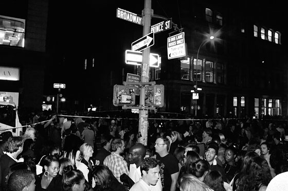
 This makes me want to be there... I love crowds

 Imagine if one of those girls stepped on you, gah

 And finally for a giraffe I know... the Delorean from Back to the Future at the Nike Store in NYC

This is all before the first model even walked down the runway. New York fashion week finished today but here are some of m favorite shows for next spring so far... I'm not done processing yet:

Altuzarra - tropical panels contrasted with black & white on sleek silhouettes
Donna Karan - tribal meets the ultimate in contemporary ladylike dressing
DVF - the name of her game is still prints prints prints and slinky wrap dresses
Marchesa - nudes and pale blue beaded, feathered and fringed gowns for all manner of ethereal occasions
Prabal Gurung - Araki, bondage and bleeding purple Roscharch prints
Proenza Schouler - the second season of the lady... grown up florals and knee length dresses
Rodarte - prom style dresses meets the master of modern art: Van Gogh and his sunflowers
Thakoon - Cowboys and Indians on acid
That's all for now folks... see you soon from London town. Can't wait for the Katrantzou show and Burberry. Night!

~ Images of FNO from NY Fashion Magazine and Fashionolgie. Runway from Style.com as usual

- Life is good

Listening to: The housemates giggling at Justin Timberlake's naked butt on Friends with Benefits
Observations: the view from the creeper window
Craving: my belly not to hurt from so much sushi