Monday, January 24, 2011

Visual Overload

Holy moly Batman, the spring Haute Couture shows began in Paris today and we haven't even entered into Canada's coldest month yet! I'm all too ready for temperatures above zero, shorts and sandals, especially because I've had nearly three months to pore over the upcoming spring trends. I really would like for Canada to stop sucking out my tan because I worked hard for it at training camp, I'm not kidding; after four hours of swimming a day you get a really really really bad training suit tan. 
Sketches from some of the couturiers for all of us in anticipation of the shows: Valentino, Armani Prive and Elie Saab. Red carpet ready?


So today is my version of sensory overload... bet you never thought I'd say that eh? How could an art history student and a self professed color magpie of my calibre have a visual overload... 
It's simple. I recently spoke of the British Trinity of digital prints in my post about architecture and fashion and I dredge them up again to throw your senses out of whack. To reiterate, the three designers that do psychedelic prints better than any other are: 
  • My prince of darkness and his successor in light: Alexander McQueen and Sarah Burton
  • The 'pixar of clothes' duo: Basso and Brooke
  • And Swiss Textiles Award winner and Central Saint Martin's grad: Mary Katrantzou
'Bring it on' you say? My reply: 'At your service'.

McQueen Spring 2009 - 'Natural Dis-tinction Un-natural Selection'
The acid trip I will never go on would probably look like this... While the show was about Darwin, the natural world and global warming, these looks were heralding in the new era of man's dominion over all things natural. Kinda sad, but if I get to wear a pantsuit like that every day, it might not be as bad. The prints are bright, crystalline and completely headache inducing, in the best possible way.

A page from my IB Higher Art workbook (my pride and joy), Swarovski crystals, the standard Jumanji scene and the Earth Hall of the Natural History Museum in London. Betcha these were on his mood board fo sho!

McQueen Spring 2010 - Plato's Atlantis 
One of his most well known shows and the last one before he died, this is his legacy... absolutely mentally, heart-wrenchingly, brilliantly spectacular. The name gives it away but I saw it as reptilian beings who make their way back to the water and morph into these people of the sea: inhabitants of the lost civilization of Atlantis. We're seeing these digitally engineered prints that look like Rorschach inkblot tests on acid, and again, only in the best possible way.
From lizard women and amphibians to the eerie love children of sea creatures and Atlanteans.


Basso & Brooke Spring 2009  
I love me a good dose of color. I feel like Wassily Kandinsky was resurrected except was entered into foster care in Japan. There can be no mistaking the Kimono-esque dresses and obi belts. They're Harajuku girls after a photoshop experiment went terrifically right. Up the contrast and the saturation and you're golden.

Right-o lets deal with the imagery here: Barbie meets the Brighton Pavilion, tries her hand at origami and falls in love with Sesshu and then undergoes an identity crisis and becomes Kimono Barbie. I've already mentioned Kandinsky who was a major player in the Abstract Expressionist movement and whose work keeps your eye extremely busy. And finally we have a Mr. Gerhard Richter whose color-sheet inspired work influenced my own IB art piece... now that I look at mine, I get a kind of Orientalistic vibe. Or it could be my brain turning to mush?


Basso & Brooke Fall 2010  
The boys stuck with their eastern influences, this time channeling the Silk-Road and Joseph's Technicolored Dream Coat with every color and fabric under the sun. They don't really adhere to the minimalist trend that was in circulation last season and it makes this collection all the better.
Alrighty, I see the shapes and colors from Salvador Dali's Persistence of Memory in the middle look... there is just something about the browns and the texture of that dress that is completely Surrealist. And I was thrown back to my family trip to Vietnam where we went to a market and were accosted by some of the most beautiful colors and embroidered fabrics I've ever seen. Oriental enough for you?


Mary Katrantzou Fall 2009 and Spring 2010

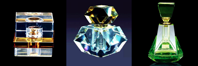
Inspiration... is it not obvious? Ornamental glass perfume bottles, duh! The imagery is alittle more obvious in the first show where the women actually look like walking perfume bottles and then the next season she delved even deeper into the glass and the way it reflects light and creates patterns, becoming more abstract and illusionistic.
So, perfume bottles yes... I thought of ones I'd seen in Egypt as a kid as they're very curvilinear and womanly and then I dug up some really brilliant geometric examples too. And I returned to Gerhard Richter who demonstrates here that he's very well rounded, first we saw painting and now he's dealt us photographs. I love his use of paint on top of the photo as if he's trying to perfect nature and possibly imitate it. The shapes and negative space created by the paint are what I drew to Katrantzou's work.

So, have your eyes had it? Wierdly mine are doing ok. Anyhow, that's all for today folks, off to review the Couture shows.

- Life is good


Listening to: Well actually I'm watching Disney's Atlantis: The Lost Empire, what a throwback to last decade
Observations: The return of the housemates with the largest abundance of food I have ever seen
Craving: A return to my health kick and this time without interruption

Saturday, January 22, 2011

And I thought I knew architecture

Week two of the semester and...I dropped Latin. Urgh. I hate quitting and I feel defeated but it was probably one of the most liberating decisions of my life (well, my university life). Try as I might I was smothered by it and somewhere along the path navigating the dreaded declensions, I was left bruised, broken and baleful.


However, good things, nay, great things have come from this decision. Down one full credit after surrendering to the likes of the nominative and genitive cases I had to find two half credits to get me back to a full course schedule. Tricky it was, yet after a couple days of constantly refreshing windows and anxiety attacks that I would fail out of school, I managed to add the two classes and boy am I stoked. [I have a point, bear with me]


So my improved class list is:
- Intermediate French
- Roman Studies
- Renaissance Art and Architecture
- Modern and Contemporary Art - 1900 to Present
* NEW Modern Architecture
& * NEW Renaissance and Reformation European History


Hell. To. The. Yeah. I'm two lectures into both classes and I love them. The Renaissance history class is brilliant because it supplements my Renaissance art class and the architecture class is just... amazing. There was a time when I really wanted to be an architect but the math and the physics scared the crap out of me and so that dream came crashing down and architecture fell into a dark and dusty recess of my mind. However, this  architecture class and a certain Greek-British designer have revived my architectural interests...
Presenting Mary Katrantzou, one of my favorite British designers, who is part of the British print revolution that includes Basso & Brooke and Alexander McQueen, and her Spring 2011 show: This Is Not A Room. 
Oh, that's an actual room, sorry. But, you will see the correlation... so drumroll please...
 
This time it is definitely not a room. Katrantzou has taken fashion in a new direction and this is one of the most revolutionary and refreshing collections I have seen to date. After the presentation she said "with this collection, I wanted to put the room on the woman, rather than the woman in the room." 
The shapes of the clothes are very simple, geometric and clean cut, yet made complex through the screening of symmetrical architectural interiors and the three dimensional details: this inspiration came from studying old copies of Architectural Digest and World of Interiors.
As if the silhouettes weren't gorgeous enough but her attention to detail blows the collection out of the water. There are extreme trompe de l'oeil effects such as necklaces that are chandeliers and or light fixtures, curtains that begin at the waist and then become chiffon-like and project out of the dresses to float wispily by the model's legs and fringing that recalls the beading along the edges of antique lampshades.
One of her innovations is the lampshade skirt that both acknowledges her architectural roots and also reinforces her brilliant illusion of interiors as exteriors. The style, nipped at the waist and flared out at the hips is an extreme shape but is one that others like McQueen have used and is feminine and tough at the same time.
This yellow and blue lampshade outfit is one of the most standout looks of the show, one of the more simple graphic designs yet one of the most boldly images. I love the fringing  around the circumference of the skirt, which makes the image all the more real.
More trompe de l'oeil effects such as the flowers that become puffed sleeves and the checkered tablecloth-esque sections of fabric that trail airy.
It truly is her greatest masterpiece yet and I'm looking forward to many new seasons of her innovative prints. Setting is also very important to this collection; it was shown in the old Eurostar terminal at Waterloo station in London and this massive structure is extremely light, austere and spacious, the perfect setting for the pops of color and classical architecture Katrantzou brought with her in her clothes.

This collection of architectural proportions awoke in me a quiet hunger back in September and it has finally been satisfied by this new architecture class. Week two we were introduced to Belgian Art Nouveau at the turn of the century and spent the whole class discussing Victor Horta's masterpiece, Tassel house (1893) in Brussels.
The exterior is snugly nestled among other row houses, yet there is a certain level of sophistication that distinguishes this building. Though often forgotten, Belgium was actually one of the largest artistic centers in Europe and this facade demonstrates the Belgian avant-garde and also reminds us why it is the home of Art Nouveau. The beauty of this exterior is what it shields on the inside, a jewel few knew existed.

Horta was a classically trained architect yet his interest in progressive materials such as glass, iron and other metals was piqued when he was commissioned to design a series of greenhouses for the monarchy. This experience is exceptionally clear in his treatment of the interior of the Tassel House which was owned by a fellow visionary and bachelor living with his grandmother, Emile Tassel. Tassel gave Horta the ultimate gift of complete creative license and his only stipulation was that the house had to be a place where his fellow academics could come for stimulating discussions and it had to be pleasing for his grandmother.
Well, I think Horta went above and beyond Tassel's vision and the house is an example of light, academic, sophisticated, bourgeoisie living while still retaining some classical references though completely avant-garde and new. From left to right: the wintergarten, main staircase and view from the living room to the dining room.


As I mentioned earlier, Horta's past experience with glass and iron when designing the greenhouses has manifested itself in a new elegant style of naturalistic, curving lines that ebb and flow throughout the house, breathing life and style. Even if you did not know of Tassel's previous experiences the ceiling of the wintergarten is extremely reminiscent of a greenhouse roof and there is no mistaking that reference.
I just wanted to throw in the ground plans for the house because I feel that they are a piece of work themselves.


The design feature of the house that entrances me most is the curving, vine-like iron work that climbs through every room like the dangerous plant from Jumanji.
There is no other place in the building that speaks of Horta's design aesthetic than the main staircase. His combination of wood, mosaic tiles, iron and glass combines aesthetic and functionality in such a way that makes it more a piece of art than a method of climbing the levels of the mysterious house.

I thought of Katrantzou's show immediately when I saw this house and the staircase. I love that though they lived 100 years apart, both Katrantzou and Horta are architectural miracle workers whose work will continue to inspire. Please tell me you see where I'm coming from...


I wanted to do alittle of architectural play myself and so I went onto the AD website to browse through old issues to find architecture and interiors that could have been inspiration for Katrantzou. Below I've compiled some photos that encapsulate the colors, light and vibrancy of the show...
While only a modest bedroom it was the pattern on the bedspread that caught my eye. It is details like that that Katrantzou has called attention to in her work.
A modern comparison for Horta's work... glass and iron but more geometrically based and hard.
A black and white checkered floor is something I see in a Katrantzou dress, starting at the skirt and then becoming a wisp of patterned fabric.
These curtains are extremely reminiscent of the ones that seem to float out of her many dresses.
There is something about this Art Deco living room that makes me think of many of her interiors.

A look at the outfits in their original context, a room, within a room on a woman. I like that. Anyway, I hope your architectural taste buds are satisfied for now, there will be plenty more to report on the architectural front this semester, I'm sure of it.

That's all for now folks, thanks!

- Life is good


Images of Tassel House from pixadus and my lecture. Architectural digest past issues for all interiors. 


Listening to: 'Little Bones' - Tragically Hip
Observations: In need of a new body... possibly one that doesn't get ear infections, bruises and shoulder 'things'
Craving: A beer at a sports bar watching a Leafs game

Wednesday, January 19, 2011

Insert Symbolism Here

Holla, we're taking a detour from red carpet dresses, the runway, ready to wear & all that jazz; instead we're moving on to something I'm equally, if not more passionate about: Renaissance art (nerdy, but true.) All you naysayers bite back your jibes and let me try to change your mind.


So, for my December Renaissance exam one of our essay topics asked us to 'Discuss how a systematic iconographic investigation (a la Erwin Panofsky) can help unpack the meaning of Flemish 15th -century paintings that are full of symbolism?' In normal English that means discuss how one finds symbolism in 15th century Flemish paintings while analyzing and interpreting... savey?


These are the moments when I love my chosen major because some pictures really do speak volumes more than words.


Right-o introducing my panel of paintings: Jan van Eyck's Arnolfini Wedding Portrait (1434), Roger Campin's Merode Altarpiece (1425) and Fra Filippo Lippi's Martelli Annunciation (1440). For this post I've decided to use an Italian painter to round out my trifecta of symbolism, hope you don't mind.
Erwin Panofsky was a professor of Art History at universities in the United States during WWII and he wrote several books on early Netherlandish paintings. His methods for finding iconography - the study of subject matter or meaning of the work of art in the context of the knowledge of the time when it was originally created - are what we are following today: He dictates that when first looking at a painting to move from one side to another and describe what you see, do not interpret. Next give it a title as you see fit and then try and extract any extra meaning from the image. 


He said to let your eyes linger on all that you see in the paintings, wonder why things were placed where the were placed and wonder if certain aspects were intentional.


So as Gandalf said 'It's the deep breath before the plunge'. And we shall plunge in with Jan van Eyck... (bee tee dubs, my information is coming from my lecture notes and my textbook Northern Renaissance Art by James Snyder).
Bring it on Jan, here we go! Alittle background info: The painting is a double portrait commemorating the marriage vows of a young Italian couple Giovanni Arnolfini, a merchant posted in the rich banking city of Bruges, and Giovanna Cenami. It shows the young couple in their bedroom during a civil ceremony and is unusual because of its dual function as a celebratory image and as a pictorial certificate of the marriage. 


Much of the symbolism is found on the central axis of the painting so we'll start from the bottom and make our way upwards: 
  • The little dog is rendered in extreme detail and van Eyck seen using the new method of oil glazing to build up between 20-30 layers of paint, giving the resulting image vibrancy and depth. These veils of paint are very textural as seen in the fine gilt fabrics Giovanna wears in addition to the dog's coat. Looking closely you can see individual brush strokes to render strands of hair. Now, this dog is not just meant to be an example of van Eyck's skill, it is one of many disguised symbols. In this case it is meant to symbolize fidelity and is extremely appropriate for this image as it is a declaration of the wife's vow to her husband. 
  • Moving upwards the next apparent symbol is the red shoes. Both patrons are barefooted as a sign of respect as well as having their heads covered, an indication of their respect for the sacrament of marriage.
  • Above that is the mirror which is exceptionally important. Around the frame are ten images of the Passions of Christ. The convex mirror is a feat in itself as it reflects the entire scene back at us and even shows us things beyond our line of vision. Earlier I mentioned that the painting counted as a pictorial certificate for a civil ceremony, well said ceremonies need to be officiated by two officials of the city or court and if you look closely in the mirror you can see this inbetween the two patrons. Also it shows that the dog was probably added to the image as an afterthought as it is not evident in the mirror.
  • Next is a Latin inscription 'Johannus van Eyck fuit hic 1434' which means Jan van Eyck was here. This gives the painting legal status as the inscription infers that he was one of the witnesses to the legal proceedings. This is very rare and is one of the first times an artist has so boldly signed his name.
  • Finally there is the iron chandelier that when you look closer you see there is only one burning candle. This is symbolic of the presence of Christ at the marriage. 
Some other points to note: The red bed behind Giovanna is immaculately made to symbolize her chastity and fidelity to her husband. In addition the spatial organization of the room doesn't fit into real world perspective, his skewed sense of three dimensional space is done on purpose to render the room in such a way so that all surfaces can be seen. In addition, Giovanna's clothing is bunched and gathered around her belly which is often interpreted as that she is pregnant but it is just symbolic of her fertility and this style is very common of this time period. Lastly we see a clear division of the image down the centre: on the left Giovanni is seen in somber attire in his world of business with a window to the outside world while on the right Giovanna is seen in a more vibrant environment among her domestic interior.


The painting is an example of the van Eyck established style of 'microscopic telescopic vision' that records the exactness of things and is supremely detailed despite it's size. I went to see it at the National Gallery in when I was at home and it's awesome.


Next is Campin's Merode Altarpiece but we're only focusing on the middle panel which deals with the Annunciation: when the Angel Gabriel came to the Virgin Mary and told her that she was going to bear God's child. 

Here we go again: 

  • So here we have Gabriel letting Mary know about her immaculate conception. And from the first window a small infant flies towards the Virgin on the rays of The Holy Spirit carrying a cross which is symbolic of the infant Christ she will be carrying. This ray of light culminates on the folds of her gown and illuminates her belly which again looks as though she is carrying child. The folds of her gown are cleverly arranged in a star and this is symbolic of the divine impregnation that is occurring immediately while Gabriel breaks the news. 
  • In the niche in the wall there hangs a brass pot of water which is symbolic of the Virgin's cleanliness and purity, indicating that she is deserving of this duty: being mother of Christ.
  • The blue and white vase with three lilies is symbolic of the trinity: the bud symbolizes The Son, the flower in bloom is The Father and the flower that is fading symbolizes The Holy Spirit.
  • The Virgin is sitting on the floor which is symbolic of her humility which is one of the highest female virtues  and one of the reasons she was chosen by God.
  • And lastly, we see candles present in this painting as in the Arnolfini: one lit and one snuffed out. The lit candle could indicate the presence of God at the event yet it is the snuffed out candle that is interesting. It could be symbolic of the marriage candle that was lit when a couple was to consummate their relationship and was snuffed out once the need was done. This symbolism could be translated as the consummation of the Virgin's marriage to God  and her conception of Christ.

Moving to our last painting and one by an Italian artist Fra Filippo Lippi which is another Annunciation. I chose this work because it has some more symbolism that we haven't dealt with...
Looking at this image the first thing that catches my eye is the column that divides the canvas in two and this leads me to notice the geometrical nature of the architecture. Gabriel is holding white flowers in his hand; again, lilies to symbolize the Virgin's purity and notice how her garments are draped around her belly, as though she was beginning to show signs of carrying a child. However, the symbol I am drawn to point out is the glass vase in the floor which is one of the most important disguised symbols of the painting. Lippi obviously made a conscious effort to put this object in the viewer's way as he's painted it so that it sits comfortably in it's own niche in the floor, in plain view. 
This vase is meant to symbolize the fact that God impregnated Mary without compromising her virginity. This phenomenon is shown through the allegory of light passing through glass vase without shattering it. Neat eh?


Finally to round out our superbly long journey, I wanted to throw in a final Annunciation, this one by Rogier van der Weyden (c. 1440). This painting combines many of the symbols and imagery from the previous paintings and it's a good way to test if you can spot them. Have at it.
From the left across: On the ledge there is another small glass vase with light shining through (virginity), next to the glass are two small pieces of fruit also seen in the Arnolfini Wedding, below that is another white and blue vase with multiple lilies (purity), the chandelier with one snuffed out candle (consummation and presence of God), below that is a brass pitcher of water (cleanliness) and on the right is an immaculately laid bed (virginity). More similarities can be drawn, but I'm pooched and you're probably bored.
- All images from Artcyclopedia.com
So

- Life is good, thanks for letting me ramble 

Listening to: 'If There Is Something' - Roxy Music 
Observations: Watching my guilty pleasure: 'The Bachelor'
Craving: Food... again