Where did Reading week go?! This week that has centred around visiting an array of galleries, creeping Fashion Week, eating ridiculous amounts of food and most important of all, having a grand 'ole time with the best family ever, has just flown by.
I refused to allow jet lag to find me (it did) but we still managed to fit in some brilliant excursions. Last Sunday we ventured into London and visited three standout exhibitions:
1. Picasso and Modern British Art at the Tate Britain
It's not surprising when an artist cites Picasso as an influence, after all the man was one of the most avant garde painters of the past century and his name remains one of the most recognized in the art world to date. This exhibition brought together many well known Picasso paintings and juxtaposed them with works by seven major British artists like Henry Moore, Francis Bacon and David Hockney. I'm not a great connoisseur of British art and to be truthful I'm not always the most receptive to modernity, but seeing as Picasso is my homeboy and it's a great year to celebrate British art, with the Queen's Diamond Jubilee and the Olympics coming to town, I thought I could suck it up for one show.
... And I'm so glad I did. Let's pretend for a second what I say here has any weight in the art world... I thought it was a giant success. It was well hung, with just the amount of work to keep you interested, not bored. The best part was that it included over 60 Picasso masterpieces, like Weeping Woman, Three Dancers, Child with a Dove, Nude Green Leaves & a Bust and many many more. These are all paintings you'd be lucky to see individually, yet here they were all together.
 I was overcome when I peeped around a corner and saw what I thought to be Guernica on the wall in a room up ahead. I've waited years to see it in person and got it in my head that I was about to have a life changing epiphany in front of it...However upon closer inspection I discovered that it was a photo reproduction. I guess you could say that disappointed was an understatement, but I should have been more realistic. I'm going to have to make the pilgrimage to the Museo Renia Sofia in Madrid to see it in person. Instead of hanging out at the Tate, the historic painting is undergoing a medical 'check up' as it turns 75 this year and it is probably a good time to give the old fellow a healthy dose of TLC.
Oh right the British fellows. Well I'd heard the names of several of the gentlemen covered in the show: Hockney, Bacon and Moore are all British heroes, but the other four: Duncan Grant, Wyndham Lewis, Ben Nicholson and Graham Sutherland were unknown to me. The problem with this exhibition is it's star, I can't really tell you anything standout about the supporting actors because Picasso stuns. Of course they do provide excellent artwork to support the concept of Picasso's excellence and influence, but there is no real standout piece or epiphany. They all exhibit elements of the revolutionary artist, but apart from that the big three (Hockney, Bacon and Moore) do most of the talking. There was one painting that I remember perfectly and that was Wyndham Lewis's Smiling Woman Ascending a Staircase (below left). The blatant similarities to Cubism (though Lewis pioneered Vorticism) and subject matter ingrained itself in my mind. Her face leers at you eerily, like the mask from V for Vendetta and it seems to be a play on Duchamp's Nude Descending a Staircase (centre). This also reminded me of the Gerhard Richter show I saw at the Tate Modern this summer where Richter also had a piece that hailed after Duchamp, Ema (Nude Descending a Staircase) (right). As I've said before I love drawing parallels in art.
Here's some evidence of Picasso's influence:
Picasso and Bacon (left) , Picasso and Duncan Grant (right)
Picasso and Moore (left) , Picasso and Nicholson (right)
2. David Hockney: A Bigger Picture at the Royal Academy
 I’d heard Hockney’s name before, but had you asked me to name or describe one of his paintings for you I would have failed miserably. What I saw at the Tate was both promising and yet made me nervous. His work ranged from brilliant Cubist-styled photo collages to comical garish paintings. I was perplexed. Nevertheless my mom assured me that this exhibition, based around landscape, had garnered rave reviews from critics and her friends so I bounced along blindly.
We met my travel weary dad there and you should know straight off the bat that my father is a brilliant, warm and hilarious individual with an enthusiasm for art that is applaudable and often roused to please me. Dad represents the average-Joe who goes to an exhibition without much prior knowledge of the artist and usually breezes through while art snobs like my mom and I take several useless hours. I’ve already professed my hatred for art snobbery, but I feel like such a brat around my dad; vaulting facts off him, talking about ‘this amazing painting I studied’ blah blah blah. Case in point when we were offered audio guides I initially balked at the suggestion.
Sarcastic me in my head: Me? Want an audio guide? Madam, I’ll have you know I’m in art history, I think I’ll be fine thank you very much.
Out loud: Oh, I’m fine thanks.
Dad: YEAH, we’ll take three.

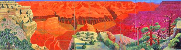
So this exhibition was a period of Hockney’s recent work: from around 2006 to the present and all the paintings were inspired by his home county: the East Yorkshire countryside. It was all so beautiful and rich that I couldn’t possibly do it justice here. Hockney took the tradition of landscape painting and made it relevant again (something I learned from the 70+ artist himself on my audioguide.) He spent many a season in the woods and fields painting what he saw over and over again, marking the changes in his spectrum of oils and brushstrokes. He works on an exceptionally grand scale and in multiple canvases per painting so that it comes together like a puzzle. It was marvellous. His use of colour is fantastic, sometimes almost garish; there were some unatural pinks in his trees that warranted sunglasses. There was a gigantic panorama of the Grand Canyon that was absolutely breathtaking. Over 60 canvases set side by side and in a rainbow of reds, ochres and oranges it captures the majesty of the landscape perfectly. Then there was the cavernous room devoted entirely to iPad drawings. Yes, iPad drawings. This wonderfully aged man (he sounds incredibly spry on the guide) had gotten ahold of an iPad earlier than anyone else in Britain and has created a massive series of 40+ coloured drawings on East Yorkshire scenery. Looking at them you couldn’t ever tell they were created on an iPad until told and then you had to wonder at his dexterity with the tablet computer and tools.

Dad and I bounced through the exhibition together listening to the audio guide, chattering nonsense, giggling and generally being a nuisance while mom glided coolly though the galleries. It was simply unbelievable and though landscape is not usually my cup of tea (I am such a snob) it is really worth seeing, or even looking Hockney up. It was great, really worth it.
3. Dale Chihuly at the Halcyon Gallery
Chihuly is a name I’m familiar with, oddly through my 9th grade biology class. When went to Kew Gardens for a field trip we discovered his work littered throughout the grounds. He’s an exceptional glass worker who creates the most fantastic, Seussical plant forms you’ll ever find. Well known for his magnificent chandeliers, Chihuly has a world-wide following and had a commerical show at a new gallery on Bond St., the Halcyon. It was a quick detour on our way home as mom wanted to show me, knowing my love for his sculptures and we were royally rewarded.
Walking in the doorway we were met with one of his famous boats, filled with fiery orbs in reds, oranges and yellows that spilled over the sides. There were several chandeliers that would look amazing in the foyer of some house in the Hamptons and a dusting of gigantic glass earns textured with paint that looked very Pollock-esque. Making the descent into the lower level of the space I was fortunate to overhear one of the salesmen having a discussion with a non-descript gentleman and his gorgeous wife.
 Salesman: ‘That one there is about twenty thousand there.’
Man: ‘And how about those…’ gesturing vaguely down the room
Salesman: “Well I believe those range from twenty to sixty thousand sir”
Man: Muffled sentences to his wife who is obviously the deciding factor vote
My head voice: I just witnessed my first potential art sale… I’m going to hyperventilate. Seconds later TWENTY THOUSAND POUNDS?
I guess you could say I was a bit overwhelmed. Part of me wishes I had the money to blow a cool twenty thou on a sculpture, but then I snap back to reality and think of all the other worthwhile things you could do with that and then I snap back to the other reality where with my degree I'll never see twenty thousand pounds.
I was pretty pleased with the day’s events and at this point dad and I were both exhausted and disheveled next to my perfect mother so we concluded our epic gallery mission and went back to Suburbia. Boss.
- Life is good
** Reading over this post I feel the need to do damage control or at least acknowledge my pompous ass-ness, but, after all I’m in art history. It's to be expected.
[Picasso, Tate, Three Dancers, Child with a Dove, Lewis, Duchamp, Richter, Hockney RA, Grand Canyon, iPad, Chihuly]
Listening to: 'Mausam and Escape' - A.R.Rahman from Slumdog Millionaire
Observations: Kingston sweet Kingston (for the next five months mind you)
Craving: N/A


.jpg)


.jpg)